pandasseabornplotlyFor additional resources, check out the following:
pandas: visualization tutorialseaborn: quick intro tutorial and detailed tutorialsplotly: Plotly Express tutorialPick up where we left off in the previous lesson:
import pandas

world = pandas.read_csv('https://raw.githubusercontent.com/jenfly/datajam-python/master/data/gapminder.csv')
world['pop_millions'] = world['population'] / 1e6
world_2015 = world[world['year'] == 2015]
matplotlib is a robust, detail-oriented, low level plotting library. seaborn provides high level functions on top of matplotlib.
If you want to quickly generate a simple plot, you can use the DataFrame's plot() method to generate a matplotlib-based plot with useful defaults and labels.
Let's use this method to create a bar chart of the total population in each world region.
region_pop = world_2015.groupby('region', as_index=False)['pop_millions'].sum()
region_pop
| region | pop_millions | |
|---|---|---|
| 0 | Africa | 1191.9177 |
| 1 | Americas | 982.6889 |
| 2 | Asia | 4391.6350 |
| 3 | Europe | 740.4830 |
| 4 | Oceania | 38.4860 |
region_pop.plot(x='region', y='pop_millions', kind='bar')
<AxesSubplot:xlabel='region'>

The plot() method returns a matplotlib.Axes object, which is displayed as cell output. To suppress displaying this output, add a semi-colon to the end of the command.
region_pop.plot(x='region', y='pop_millions', kind='bar');
We can create different kinds of plots using the kind keyword argument, such as scatter and line plots, histograms, and others.
Let's use the world_2015 DataFrame to create a scatter plot of life expectancy vs. GDP per capita
world_2015.plot(x='gdp_per_capita', y='life_expectancy', kind='scatter');

pandasworld_2015.plot?) or check out this tutorialpandas plots can be further customized using matplotlib functions and methodspandas plots are convenient for simple visualizations, they are pretty limited (unless you want to customize them with a lot of additional matplotlib code)seaborn library also builds on matplotlib and integrates with pandas data structures, but is much more powerfulMost seaborn plots fall into one of three main categories:
seaborn: scatter plots and line plots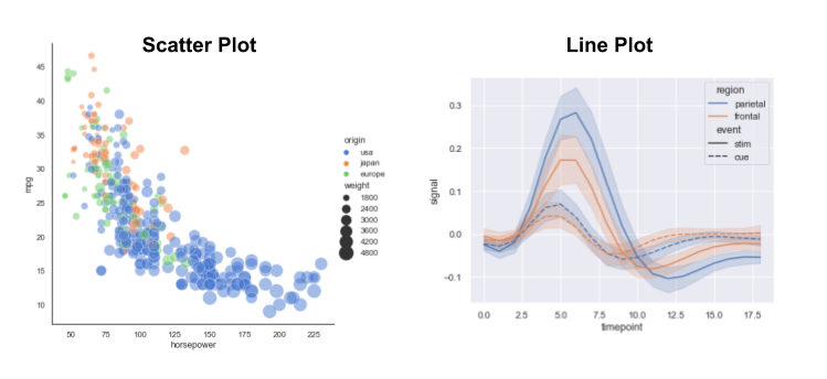
seaborn — a few examples are shown below
seaborn — a few examples are shown below
Let's import the seaborn library and give it the commonly used nickname sns:
import seaborn as sns
Switch to seaborn default aesthetics:
sns.set_theme()
matplotlib-based plots that are created after you run this command, including those generated by pandasLet's re-create our scatter plot from earlier using seaborn's relplot() function for relational plots
relplot() creates either scatter plot or a line plot (default is scatter)sns.relplot(data=world_2015, x='gdp_per_capita', y='life_expectancy');

We can easily enrich this plot with additional information from our data by mapping other variables to visual properties such as colour and size
Let's colour each point by region:
sns.relplot(data=world_2015, x='gdp_per_capita', y='life_expectancy', hue='region');

a) Initial setup (you can skip to part b if you've already done this):
seaborn library and give it the nickname snssns.set_theme() (turns on seaborn styling)world_2015 which contains only the rows of world where the column year is equal to 2015.b) Use relplot() to create a scatter plot of life_expectancy vs. gdp_per_capita from world_2015, in which the points are coloured by income_group.
c) Add the keyword argument aspect=1.5 to the relplot() function call. How does the plot change?
life_expectancy and gdp_per_capita appears to be log-linear, let's set the x-axis to log scaleg = sns.relplot(data=world_2015, x='gdp_per_capita', y='life_expectancy', hue='region')
g.set(xscale='log', title='Life Expectancy vs. GDP per Capita in 2015');

We can save our visualization in a variety of formats using the savefig() method. Let's save the previous figure (stored in the g variable) to PNG format in the figures subfolder:
g.savefig('figures/life_exp_vs_gdp_percap.png')
After running the above command, you'll now have a PNG image file life_exp_vs_gdp_percap.png in your working directory (the same folder where your Jupyter notebook is saved). You can use this PNG file to share your visualization in a document, slideshow, web page, etc.
Note: Viewing Documentation
If you try to view the documentation with
g.savefig?, there is very little information because this method is calling another method belonging to the attributeg.fig(thematplotlibfigure object). To view thesavefig()documentation, you can run the following command in your Jupyter notebook:g.fig.savefig?Note: Saving Pandas Plots
When you use the
plot()method of apandasDataFrame, as we did in the first part of this lesson, this figure can also be saved to a file, but the syntax is a bit different. Here is an example:# Bar chart of total population for each region ax = region_pop.plot(x='region', y='pop_millions', kind='bar'); # Save to PNG file # -- The bbox_inches argument is often not needed, but for this particular # bar chart it's needed to prevent the labels from getting cut off.) ax.get_figure().savefig('figures/region_populations.png', bbox_inches='tight')
These other examples show some additional syntax options.
We can customize our scatter plot to be a "bubble plot", where the size of each marker is proportional to one of the variables in the data
Let's make the markers proportional to population size:
size='pop_millions' tells relplot() which variable to usesizes=(40, 400) customizes the range of marker sizes to usealpha=0.8 adds some transparency so it's easier to see overlapping markersg = sns.relplot(data=world_2015, x='gdp_per_capita', y='life_expectancy', hue='region',
size='pop_millions', sizes=(40, 400), alpha=0.8)
g.set(xscale='log', title='Life Expectancy vs. GDP per Capita in 2015');

We've visualized four variables (gdp_per_capita, life_expectancy, region, and pop_millions) in this single two-dimensional plot!
region could be visualized by mapping it to coloursLet's start with a simpler version of our plot:
g = sns.relplot(data=world_2015, x='gdp_per_capita', y='life_expectancy', hue='region')
g.set(xscale='log');

Instead of mapping region to colours, let's now map it to facets using the col='region' keyword argument:
g = sns.relplot(data=world_2015, x='gdp_per_capita', y='life_expectancy', col='region')
g.set(xscale='log');

g = sns.relplot(data=world_2015, x='gdp_per_capita', y='life_expectancy', col='region',
                col_wrap=3, height=3)
g.set(xscale='log');

We can also visualize the income groups by mapping them to colours:
g = sns.relplot(data=world_2015, x='gdp_per_capita', y='life_expectancy', col='region',
                col_wrap=3, height=3, hue='income_group')
g.set(xscale='log');

We can use the hue_order keyword argument to make sure the income groups are ordered properly:
income_order= ['Low', 'Lower middle', 'Upper middle', 'High']
g = sns.relplot(data=world_2015, x='gdp_per_capita', y='life_expectancy', col='region',
                col_wrap=3, height=3, hue='income_group', hue_order=income_order)
g.set(xscale='log');

Instead of manually specifying
hue_ordereach time, we could instead convert theincome_ordercolumn to a Categorical data type (and similarly for the other categorical variables: country, region, and sub-region). This would ensure the categories are automatically plotted in the correct order.
seaborn, we can also create plots which perform statistical transformations behind the scences, calculating new values to plotReturning to our world DataFrame, which contains data for all years, recall that we can use grouping and aggregation to compute the total world population in each year:
world.groupby('year', as_index=False)['pop_millions'].sum()
| year | pop_millions | |
|---|---|---|
| 0 | 1950 | 2521.5914 |
| 1 | 1955 | 2755.4391 |
| 2 | 1960 | 3014.5238 |
| 3 | 1965 | 3317.6620 |
| 4 | 1970 | 3676.8109 |
| 5 | 1975 | 4052.1130 |
| 6 | 1980 | 4428.6840 |
| 7 | 1985 | 4841.1945 |
| 8 | 1990 | 5294.2122 |
| 9 | 1995 | 5714.3521 |
| 10 | 2000 | 6101.9393 |
| 11 | 2005 | 6495.9793 |
| 12 | 2010 | 6918.4071 |
| 13 | 2015 | 7345.2106 |
world using the relplot() functionestimator='sum' keyword argument tells relplot() how to aggregate the data behind the scenesci=None keyword argument tells relplot() to omit the 95% confidence interval which is included by defaultsns.relplot(data=world, x='year', y='pop_millions', kind='line',
estimator='sum', ci=None);

Now let's see how the population has grown in each income group over time
income_group variable to the colour and also to the line style, to make it easier to distinguish the linessns.relplot(data=world, x='year', y='pop_millions', hue='income_group', hue_order=income_order,
style='income_group', kind='line', estimator='sum', ci=None);

And we can use facets to see the population growth of each income group within each region:
sns.relplot(data=world, x='year', y='pop_millions', hue='income_group', hue_order=income_order,
            style='income_group', kind='line', estimator='sum', ci=None, col='region',
            col_wrap=3, height=3);

a) Initial setup (you can skip to part b if you've already done this):
income_order which contains the following strings: 'Low', 'Lower middle', 'Upper middle', 'High'b) Use relplot() to create a plot similar to the previous example, but plotting life_expectancy on the y-axis instead of pop_millions and aggregating with the mean instead of the sum.
estimator='mean'.world DataFrame, year on the x-axis, income_group maps to line colour and style, income_order for the hue_order argument, and facetting on region.Bonus: Do you spot anything strange in the subplot for the "Americas" region? How could you investigate this using the techniques we learned in the Intro to Pandas lesson?
relplot() function is a "figure-level" function which creates a figure and one or more axes for the facets (if any)sns.scatterplot() for scatter plotssns.lineplot() for line plots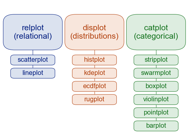
estimator and ci keyword arguments in our previous example are specific to sns.lineplot(), so they don't appear when you look at the documentation for sns.relplot()sns.lineplot() and sns.scatterplot() for details specific to these functions, and similarly for other axes-level functionsTo learn more about figure-level and axes-level functions, check out this tutorial
Most seaborn plotting functions are designed for data tables that are in long-form, rather than wide-form
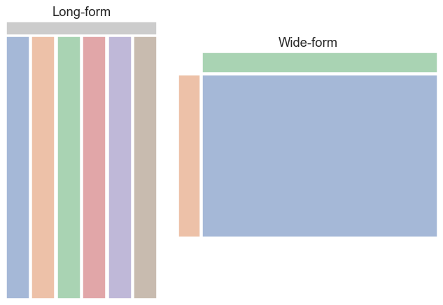
In a long-form data table:
Our world data is in long-form. Let's take a subset with just the country, year, and population variables. This table contains fewer variables but is still in long-form.
pop_long = world[['country', 'year', 'population']]
pop_long.head()
| country | year | population | |
|---|---|---|---|
| 0 | Afghanistan | 1950 | 7750000 |
| 1 | Afghanistan | 1955 | 8270000 |
| 2 | Afghanistan | 1960 | 9000000 |
| 3 | Afghanistan | 1965 | 9940000 |
| 4 | Afghanistan | 1970 | 11100000 |
In a wide-form data table, the columns and rows contain levels of different variables. We can reorganize pop_long in a couple of different ways to create a wide-form table, for example:
pop_wide = pop_long.pivot(index='year', columns='country', values='population')
pop_wide.head()
| country | Afghanistan | Albania | Algeria | Angola | Antigua and Barbuda | Argentina | Armenia | Australia | Austria | Azerbaijan | ... | United Kingdom | United States | Uruguay | Uzbekistan | Vanuatu | Venezuela | Vietnam | Yemen | Zambia | Zimbabwe |
|---|---|---|---|---|---|---|---|---|---|---|---|---|---|---|---|---|---|---|---|---|---|
| year | |||||||||||||||||||||
| 1950 | 7750000 | 1260000 | 8870000 | 4550000 | 46300 | 17200000 | 1350000 | 8180000 | 6940000 | 2930000 | ... | 50600000 | 159000000 | 2240000 | 6260000 | 47700 | 5480000 | 24800000 | 4400000 | 2310000 | 2750000 |
| 1955 | 8270000 | 1420000 | 9830000 | 5120000 | 52900 | 18900000 | 1560000 | 9210000 | 6950000 | 3330000 | ... | 51100000 | 172000000 | 2370000 | 7300000 | 54900 | 6760000 | 28100000 | 4770000 | 2630000 | 3200000 |
| 1960 | 9000000 | 1640000 | 11100000 | 5640000 | 55300 | 20600000 | 1870000 | 10300000 | 7070000 | 3900000 | ... | 52400000 | 187000000 | 2540000 | 8550000 | 63700 | 8150000 | 32700000 | 5170000 | 3040000 | 3750000 |
| 1965 | 9940000 | 1900000 | 12600000 | 6200000 | 60800 | 22300000 | 2210000 | 11400000 | 7310000 | 4590000 | ... | 54300000 | 200000000 | 2690000 | 10100000 | 74300 | 9820000 | 37900000 | 5640000 | 3560000 | 4410000 |
| 1970 | 11100000 | 2150000 | 14600000 | 6780000 | 67100 | 24000000 | 2530000 | 12800000 | 7520000 | 5180000 | ... | 55600000 | 210000000 | 2810000 | 12100000 | 85400 | 11600000 | 43400000 | 6190000 | 4170000 | 5180000 |
5 rows × 178 columns
pop_wide contains the same data as pop_long, but the variables do not correspond to the columns, and each row contains multiple observations.
To learn more about long-form vs. wide-form data, check out this tutorial.
catplot() function to create a bar plot of mean life expectancy in each region in 2015catplot() will group and aggregate the data behind the scenesestimator keyword argument, it defaults to aggregating with the meang = sns.catplot(data=world_2015, x='region', y='life_expectancy', kind='bar', aspect=1.5)
g.set(title='Mean Life Expectancy by Region in 2015');

plotly, we will look at a few examples with the Plotly Express libraryplotly-based plots, similar to using seaborn as a high-level interface to matplotlib-based plotsseaborn, but it uses the same concepts such as semantic mapping and facetsFirst we'll import Plotly Express and give it the commonly used nickname px:
import plotly.express as px
Let's recreate one of our previous scatter plots:
px.scatter(data_frame=world_2015, x='gdp_per_capita', y='life_expectancy', color='region',
           size='pop_millions', size_max=30, log_x=True, hover_data=['country'],
           title='Life Expectancy vs. GDP per Capita in 2015')
seaborn version is that you can hover over any point to see the data values (country,, region, gdp_per_capita, life_expectancy, pop_millions)We can save a plotly figure as an HTML file which contains the interactive visualization. First we assign our figure object to a variable, and then use the write_html() method.
fig = px.scatter(data_frame=world_2015, x='gdp_per_capita', y='life_expectancy', color='region',
                 size='pop_millions', size_max=30, log_x=True, hover_data=['country'],
                 title='Life Expectancy vs. GDP per Capita in 2015')
fig.show()
fig.write_html('figures/plotly_life_exp_vs_gdp_percap.html')
We can also save the figure as a static image such as PNG with the write_image() method. This requires some additional dependencies to be installed, as per these instructions.
fig.write_image('figures/plotly_life_exp_vs_gdp_percap.png')
Figures can also be exported to the free Chart Studio hosting service using Chart Studio's Python package or incorporated into a dashboard with Plotly Dash.
We can create facet plots:
px.scatter(data_frame=world_2015, x='gdp_per_capita', y='life_expectancy',
           facet_col='region', facet_col_wrap=3,
           color='income_group', category_orders={'income_group' : income_order},
           log_x=True, hover_data=['country'],
           title='Life Expectancy vs. GDP per Capita in 2015')
We can easily add another variable to our plot as an animation frame
px.scatter(data_frame=world, x='gdp_per_capita', y='life_expectancy', color='region',
           size='pop_millions', size_max=30, log_x=True, range_y=(20, 90),
           title='Life Expectancy vs. GDP per Capita (1950-2015)',
           animation_frame='year')
seaborn plotsseaborn is usually a better optionTo learn more about Plotly Express, check out this tutorial.